We need to talk about Adidas...
An investigation into the recent aesthetic failings of a retail giant

It’s time to talk about Adidas. I know what you’re thinking. May, why are you dedicating an entire essay to a brand? I offer the simple explanation that this goes beyond a brand. Perhaps even beyond tennis. The question of Adidas’s recent corporate decisions cut directly into questions of what beauty and joy might even mean to the human soul. It is not a discussion I take lightly!
I am sure that we are all, by now, familiar with the recent failings of Adidas to design aesthetically inoffensive tennis kits. At first it was the muddy tire track kits at the US Open. At the time I’d figured it was simply a corporate miscommunication. No reasonable person, I thought, would sign off on that shade of muddy green (or is it brown?) in conjunction with those tire track patterns. Rather than the hallowed stands of Arthur Ashe, the entire affair reminded me of times my family car had been stuck in deep mud on an ill-planned road trip. Not exactly the image I would personally conjure if I wanted to convince a crowd to purchase my product, but I digress.
The tire tracks I could forgive as a fluke, but Adidas kept up its deluge of design disasters. The popsicle shorts which gave way to poop shorts. The indecipherable cuneiform which was marketed as “Parisian.” The graphing paper supernova which is supposed to give “New York” vibes. It was too much for my simple mind to comprehend.1

These questions kept me up for nights on end, until one night I decided to track how we’d come here. My quest, therefore, began with the simple question: why have Adidas kits been so terrible recently?
My investigation began on a very boring Thursday morning at approximately 8:47 am. My preliminary research from the night before had not revealed much in the way of an actual answer. As it unfortunately turns out, most people do not care about the internal corporate dynamics of a sneaker brand. It was Saturday by the time I finally found a lead. It was a tennis news blog, discussing the—shall we say underwhelming—reaction to the newest US Open rollout. The article mentioned the addition of a new member to the Adidas creative team. The bland corporate language surrounding the whole affair spoke to my soul, as I knew any chance of drama in this story was going to be swathed in beige legalese.
Anyone who has seen my Twitter profile knows that I am a fan of Paul McCartney. When I realised that the new addition to the Adidas creative team was the son in law of none other than Paul McCartney, I was delighted. Unfortunately, most people do not care about the career of Paul McCartney’s son in law2, so the information I was able to find was limited to the sort of sleek corporate promotion companies run when they want to make a big reshuffle look good.
However, he was only promoted to his current position as Adidas creative chief in March of 2022. The process of creating tennis kits takes a long time—product launches are often planned up to a year in advance, meaning companies rely on the service of trend forecasters to keep their designs on trend.3 If Paul McCartney’s son in law had only been promoted to this position a few months ago, it is doubtful he is responsible for the tire tracks or the popsicle kit. In fact, I cannot in good conscious even pin the gogurt explosion or the graph paper supernova on this innocent man.
I yearned to understand the bureaucratic machinations of Adidas that had caused this sartorial tragedy to occur. If Paul McCartney’s son in law was not responsible for these designs, I wondered who actually did sign off on them. After all, as John Donne once said, no man is unto himself an island. It takes a village to produce poop shorts, from the initial design to prototypes and mockups, all the way to consumer focus groups. At the end of the day someone had to sign off. There had to be someone in the big chair signing away all of our fates as they approved these wretched kits.
The truth was far more Kafkaesque than I was willing to reckon with. There had been no creative director at Adidas for more than two years. It was a ship with no captain, left to drift in the murky waters of fashion tragedy. What I once believed to be the singular (if not failed) vision of an individual despot was indeed the fragmented will of many. I was left in shock, and not sure of where to proceed.
It was at this point I realised that the issues at Adidas were a bit deeper than a few bad fashion choices. I uncovered a New York Times article from 2020 outlining a series of employee protests regarding the company’s allegedly racist corporate structuring. Now this was interesting to me. Everything I’d read on the company’s website up until this point seemed to be pushing for a vaguely progressive politics. Multiple kits had been collaborations with artists of colour to incorporate their heritage with the tennis world. There was an entire section on their website dedicated to upholding diversity in athletics.
This is not to mention the way in which sportswear often interacts with streetwear and other manifestations of Black American culture. It was therefore quite jarring to read that only a little above 5% of Adidas North American employees were in fact Black—and the percentages were even lower higher up on the corporate ladder. In essence, the 2020 Adidas corporate protests were about this contradiction—the way Black faces and culture were being used by a mostly white corporate team for the purpose of profit.
These protests resulted in a corporate reshuffling—the details of which are partially lost to the sands of time. Now this kind of makes sense. If I were Adidas, I wouldn’t exactly be publishing all the times my employees were racist to the point of being forced to resign either. However, the detail most crucial for our story is this: the creative director that was employed by Adidas had to resign as a result of tweets supporting Kyle Rittenhouse. Therefore, from August of 2020 until March of 2022, there had been nobody (officially) in charge of the overarching aesthetic identity of the Adidas brand
This weird dichotomy between an outwardly progressive image and a profit-oriented internal politics is evident in the varying kit design disasters that I have outlined already. In order to make a political statement through an aesthetic medium, a coherent vision is required. It’s going to come off as hollow and exploitative if a company tries to profit off of a political movement unless it’s done with the utmost sensitivity—something Adidas cannot do, due to the lack of a cohesive creative direction.

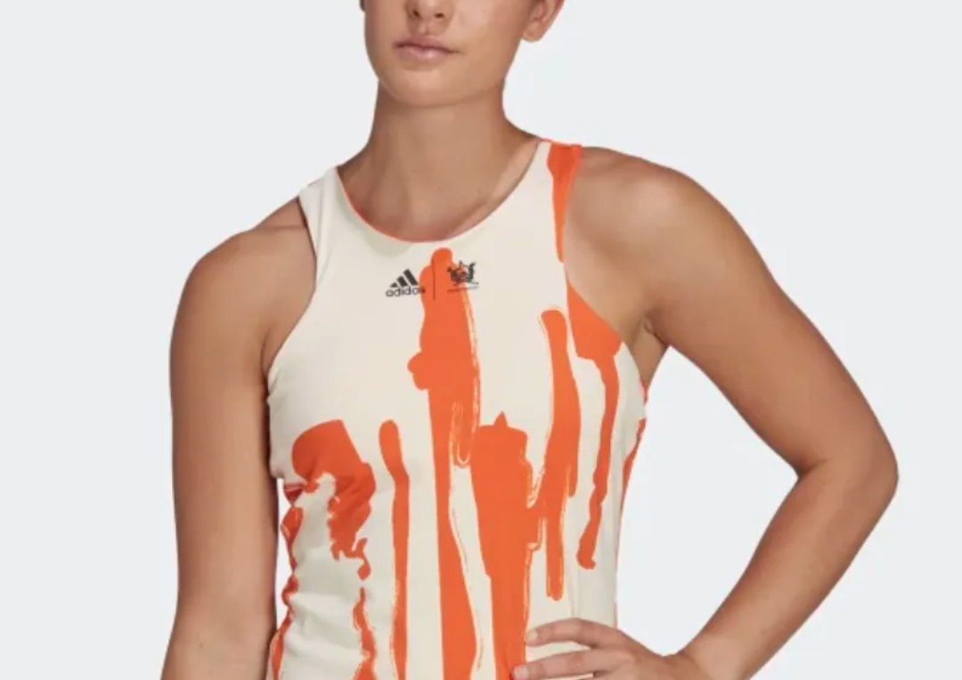
I realised that my next step in my investigation would be to analyse the way this hollow politics manifests in individual kit failures. Instantly I knew where I had to start. The poop shorts. It was the holy grail.4 Now, dearest reader, you may be wondering how on earth these shorts might push a progressive politics. And I answer you with information taken directly from the Adidas website: they are meant to “highlight the erosion of the Great Barrier Reef”. That’s right. Those brown streaks in the crotch area? They’re actually our rapidly deteriorating coral reefs, and you should be sorry you ever laughed at Adidas’s earnest and uncynical attempts to protect them.
It is precisely Adidas’s attachment to profiting off of an ostensibly progressive message without an accompanying change in internal politics as exemplified by the 2020 protests that results in failures like this. There is no cake under the frosting—it’s all just empty signifiers. This is especially egregious when looking at multiple cases of Adidas greenwashing its apparel with untrue claims of environmental consciousness. If this co-optation had been thought out more (or heaven forbid, supervised), things may have turned out less shitty.5
Another example of half baked progressive aesthetics is the Adidas x Thebe Magugu collection, recently unveiled for this upcoming US Open. Adidas themselves discusses how this collection is intended “champion diversity and inclusion in the sport,” highlighting a celebration of global “cultures and communities.” If an artist were to approach the aesthetic task of representing their particular community, they would be creating a piece that generates its transgressive value from something deeply personal. However, Magugu and the team at Adidas cannot do this, because the personal cannot conform to the mass produced corporate environment in which tennis kits are produced.
The result is a murky middle ground between a genuinely political aesthetic and the capitalist requirements of a multimillion dollar company. In an attempt to meet the middle, the personal gives way to symbols so abstract they come to resemble bleach stains, further confusing the intended audience of these kits. Indeed, how do these streaks of colour represent LGBT+ diversity in sport, as Adidas alludes to in their piece on the collection?

Honestly, it’s not that difficult to design something which is obviously intended for pride. All it takes is a few rainbows, maybe a “love is love” splashed on a t-shirt, and you’ve got a pride collection. Adidas, however, decided they were not going to take this route. Instead, they inexplicably chose to drop this ransom note of a dress. I don’t think I’d ever consider wearing (or heaven forbid buying) this dress under normal circumstances, but upon finding out it was supposed to be a statement on queerness in the tennis world I was even more against it as a concept.
The pride dress is supposedly inspired by the aesthetic sensibility of queer protest art, but I can’t help but feel the driving force behind that activism drained in the most corporate rendition possible. It certainly does not feel like progress in a recognisable form when I already know that 75% of ATP players reported hearing anti-LGBT+ slurs in the locker room–a statistic dismissed as “banter” in the accompanying report. The kit occupies an incredibly dichotomous world in which queer struggles are not serious enough for the ATP to do anything tangible to change its homophobic culture, yet these struggles are fertile ground for the newest advertising campaign.

In essence, the reason Adidas’s kits have been so bad is because they are instances of a brand trying to co-opt progressive politics without the proper oversight or attention required to do it tastefully. This, combined with a weird symbolic logic that I will elaborate on shortly, results in a fragmented aesthetic vision which ultimately fails to work in the wider scheme. These issues are exacerbated by the usual dysfunction that comes with a large corporate reshuffle.
The discussion of diverse culture is even more concerning given the company’s history of using marginalised cultures (particularly Black American culture) in order to sell products, while maintaining a corporate structure which actively sidelines non-white employees. The vagueness with which terms like “diversity” are attached to unclear aesthetic forms betrays the discordant internal company politics which I outlined earlier. Adidas’s kit failures are therefore a microcosm of wider internal failings at the corporate level—they attempt to thread the needle of gaining profit while also forwarding an ostensibly progressive politics, all without a creative director.
The Adidas mystery therefore concludes with a whimper rather than a bang. Instead of a tale of a designer going rogue or a deeper conspiracy, the reason Adidas kits have been subpar is due to a corporate attempt to capitalise on progressive politics. This is especially egregious when examining issues like homophobia and racism which are present within the tennis world. It feels like an attempt to profit off of these issues without doing the actual work to substantively solve them within the community. These things are difficult to get right, and even more so without a creative director. It is therefore crucial to ensure that if you are going to talk the activist talk, so to speak, that you’re also prepared to walk the walk.
In vain I tried to imagine the crisp corporate offices where these designs were regretfully birthed. Who signed off on this? Who was at the helm of all of these regretful decisions?
His name is actually Alasdhair Willis but I will continue to refer to him as Paul McCartney’s son in law because I find that more entertaining than just some random fashion guy doing these things.
I suppose it’s difficult to ascertain what trend Adidas is chasing with these questionable designs but this is beside the point.
Usually taste is subjective—if you criticise something too hard you risk someone turning around and going “wow I actually like the tire track kit, why are you being so rude for no reason?” This is not the case with the poop shorts. You show one picture of those babies to anyone off the street and they will immediately tell you nope!
Please forgive the pun.
I enjoyed this even though I'm still not entirely convinced. I think the reasons you outlined provide a believable explanation for the general idea behind these kits but still there was someone who actually designed them and thought they looked good enough to present to other people within Adidas who looked at them and thought they were good enough to be displayed on the biggest sporting arenas in the world and TV audiences of millions. It's simply impossible to understand how those pants didn't make someone with enough authority say "this cannot be launched". There has to be more behind all this.